Role Team Tools
Research Justin Stein Figma
Ideation Olivia Renaud Adobe illustration
UI/UX Paul Draper Adobe Fresco
Illustration
Prototyping
A new partnership begins..........
To prepare for Seers partnership with Burberry, we needed to create a user friendly navigation page that allowed users to easily engage with their content
Project Overview
Seer is a SaaS software product that provides sales associates of high-end fashion houses with helpful tools that make interacting with clients a frictionless experience.
For this project, I was tasked with creating an interface that would allow users to easily navigate the product. Allowing users to easily catalog, organize, and send different luxury items to consumers. These designs were done in preparation for our launch with our partnership with Burberry. Before they began using the program, Burberry provided us with feedback and requested several changes that were needed before they could begin.
UX Challenge
Content curation was the first major UX hurdle for us. Our users were not tech-savvy and had little to no experience using enterprise software. Our challenge was figuring out how to easily allow them access to the content that they had in different places across the product. After identifying which applications in the product users used most frequently, we were tasked with creating an interface that allowed them to easily access each feature.
The second major UX challenge was ensuring a simple and usable experience on the main screen, while also allowing the multiple layers of content and navigation.
Research
my research centered on the type of users that would be using the platform, and the frequency each user would be engaging with it. We used more than 100 user surveys to help us qualify what users want, and just as important, what their customers want. One-on-one interviews helped me understand user journeys and specific issues I would need to address.
Findings
1. Users were not using a large percentage of the platform in any real meaningful way
2. Users were frustrated with lack the of navigation and organizational tools available
3. Admin users were far more concerned with the existing problems in the product than stylist were. Admins desire for change was aggressive, while stylists largely were ambivalent
4. Fixing problems and keeping in mind all the different types of users would be our biggest challenge.
Getting Closer to User-Centered Design
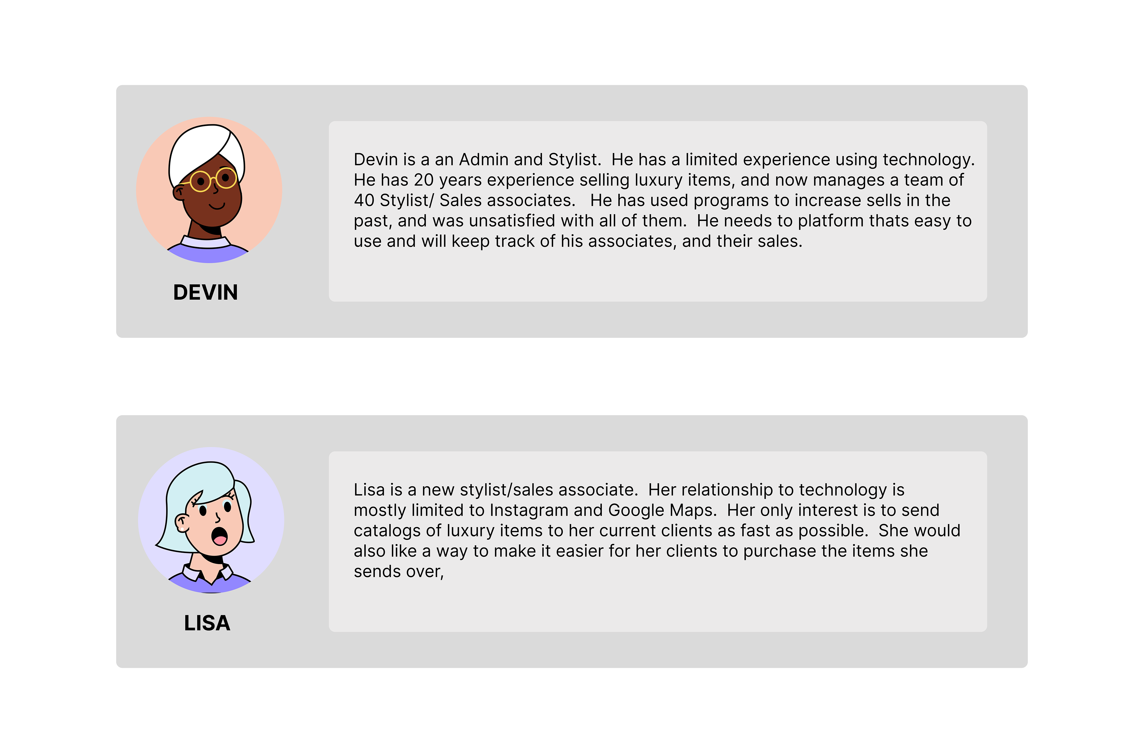
The end goal for every user in this space is to sell as many luxury items to their customer base as possible. The trick for us was to figure out how to get users to use all the other tools, that will help with organization and bring clarity to their process, which would essentially help them sell more. To do this we had to create personas to help us build an empathetic product that functions properly.
As research and design proceeded, I focused primarily on two personas. The stylist and admin. Though there were many subcategories within these two, for the navigation interface itself, we felt that narrowing down to these two personas was key.
As research and design proceeded, I focused primarily on two personas. The stylist and admin. Though there were many subcategories within these two, for the navigation interface itself, we felt that narrowing down to these two personas was key.
User Personas
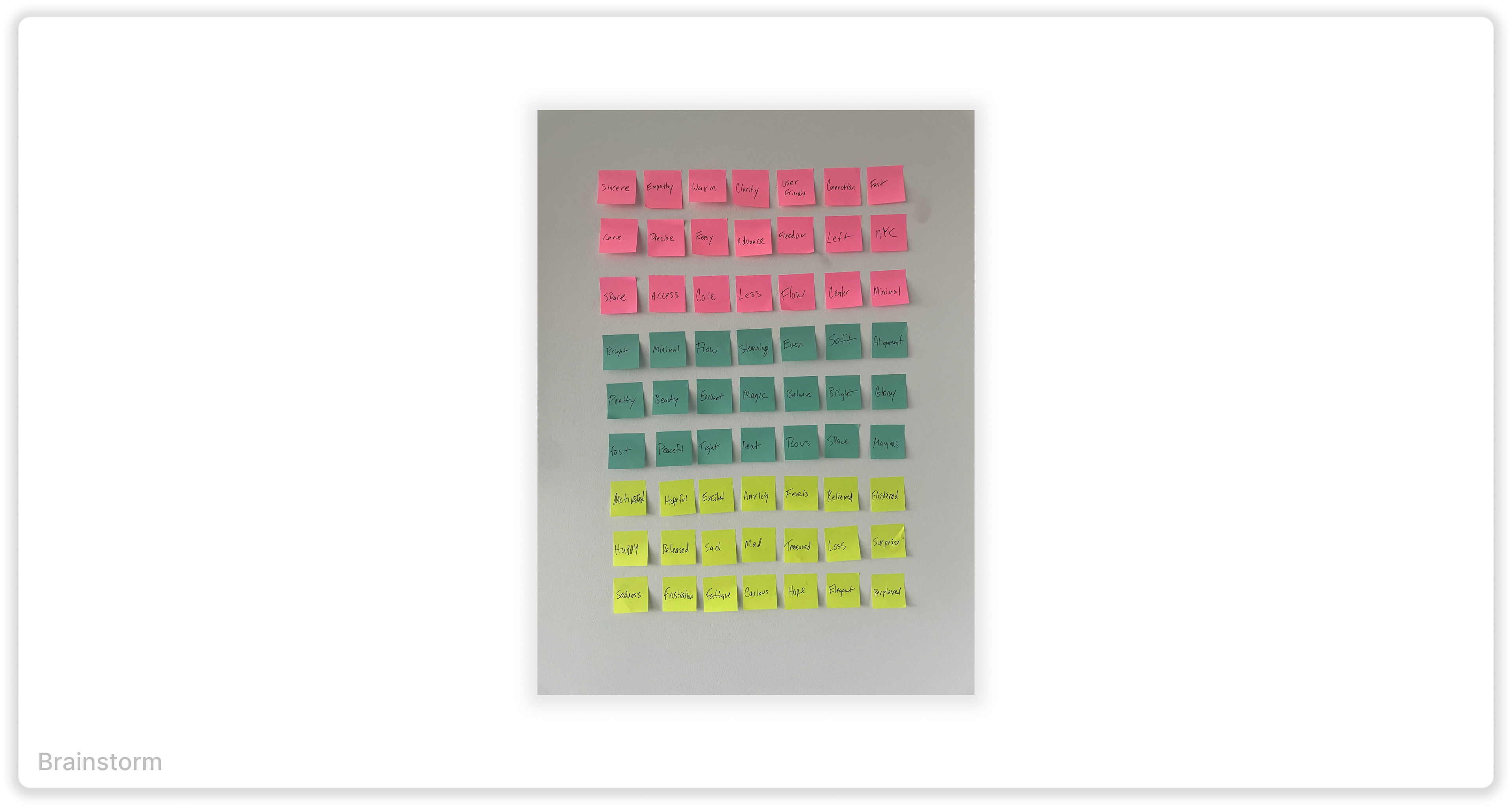
Since the experience is shared amongst different companies with very different needs, we had to think through multiple levels of accordances. the page had to work for all users, while also keeping in mind their various integrations. I used to user interview data to come up with words that we wanted to move towards, and ones we wanted to stay away from.
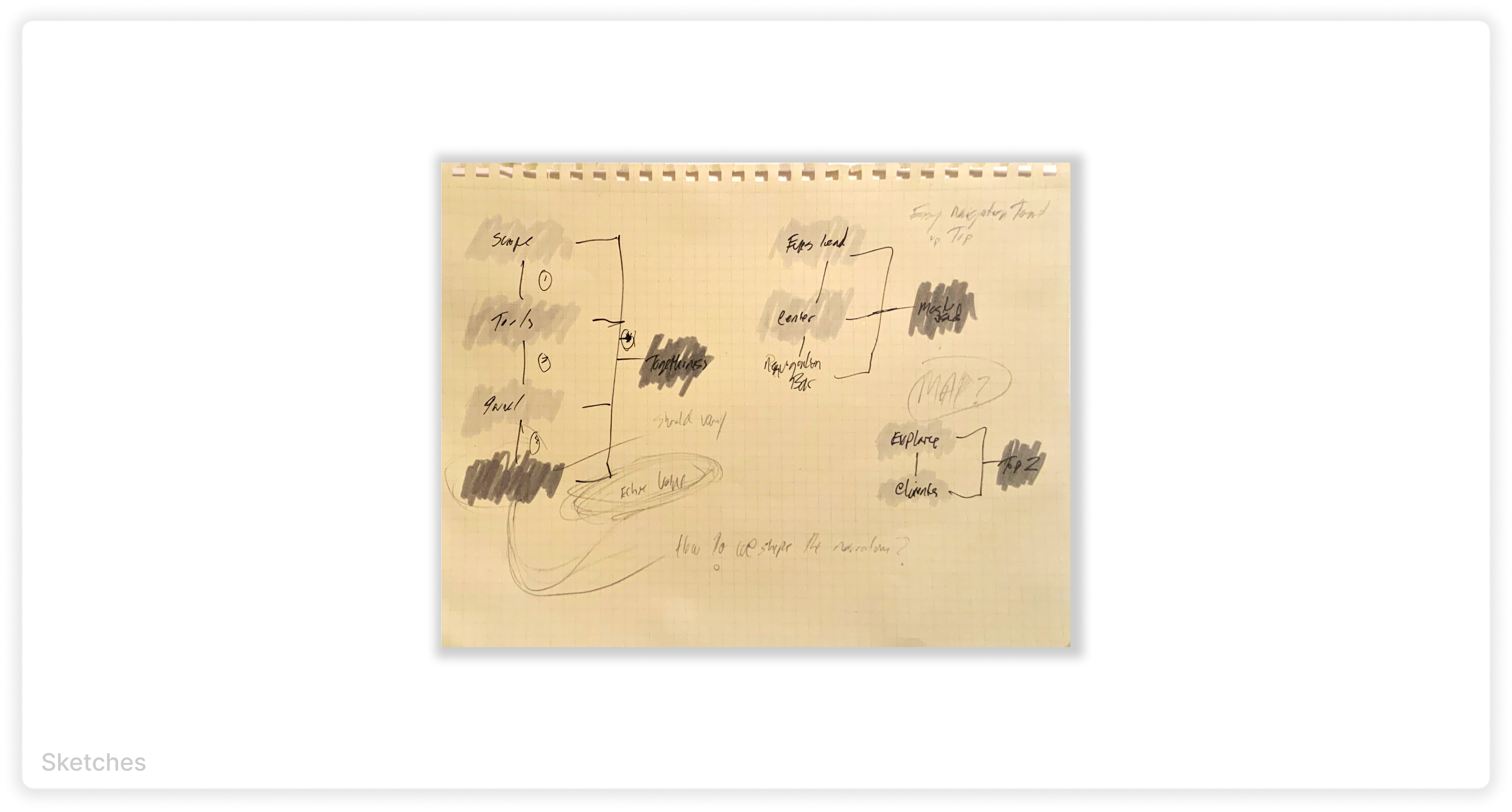
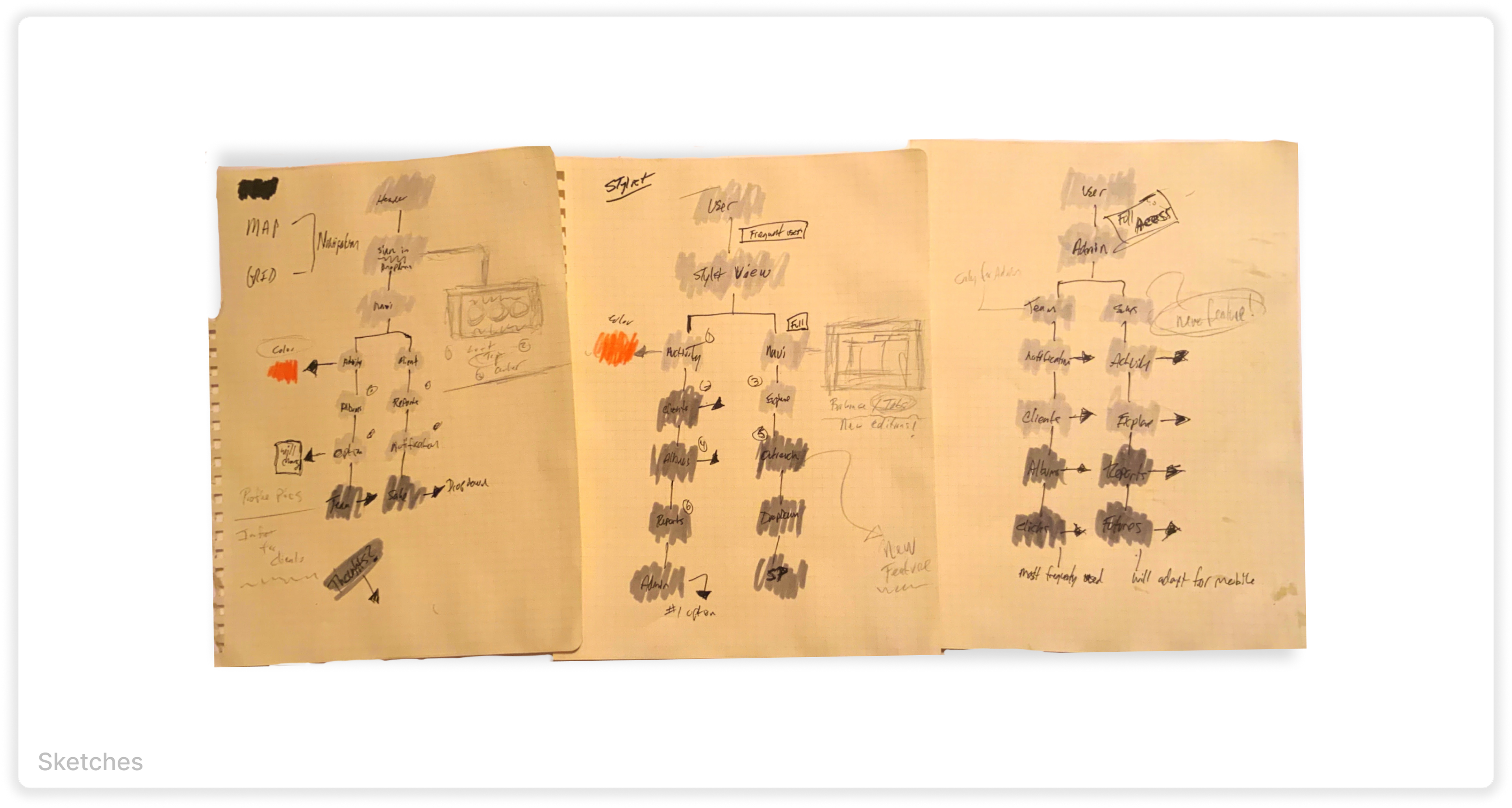
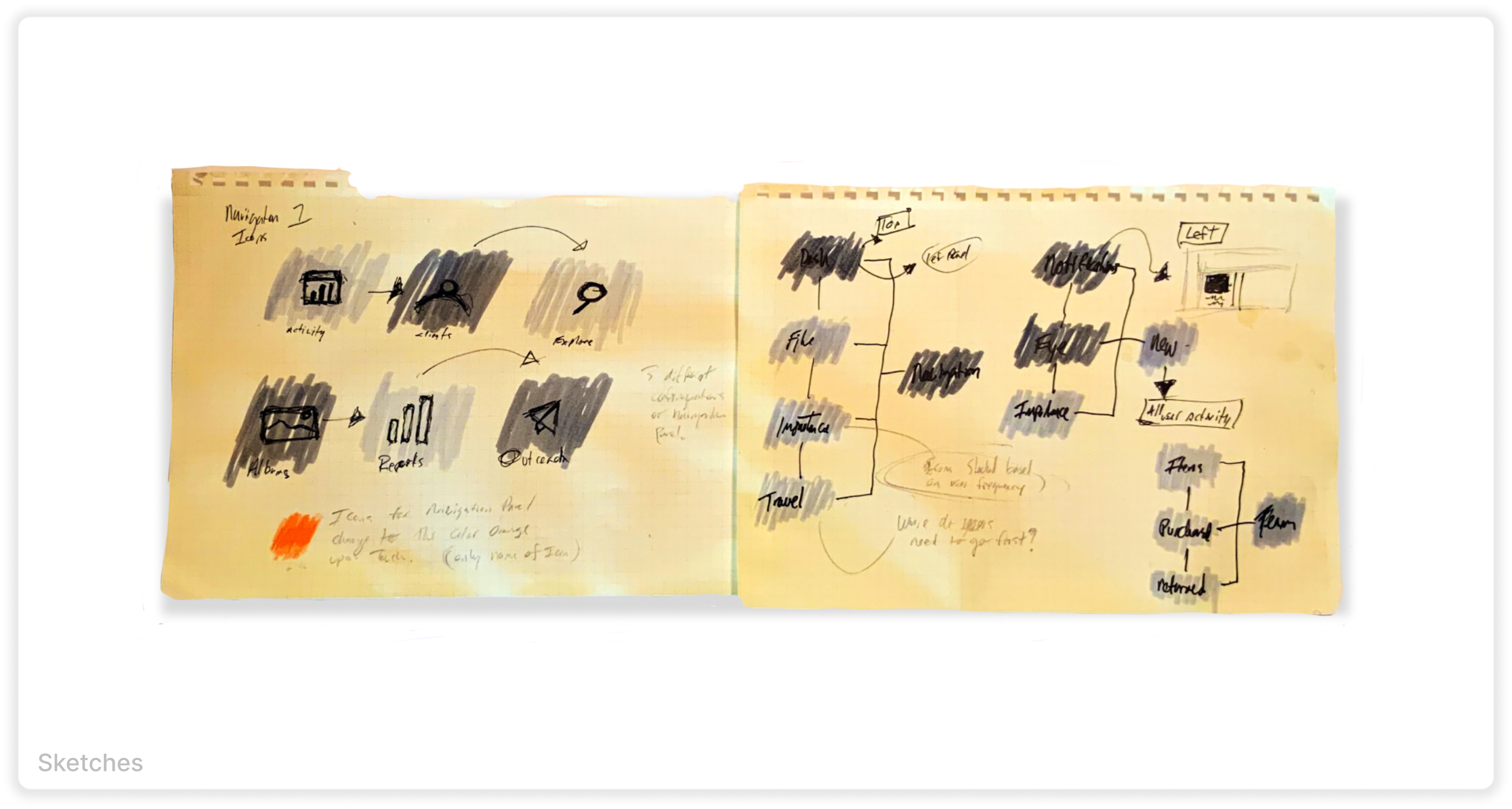
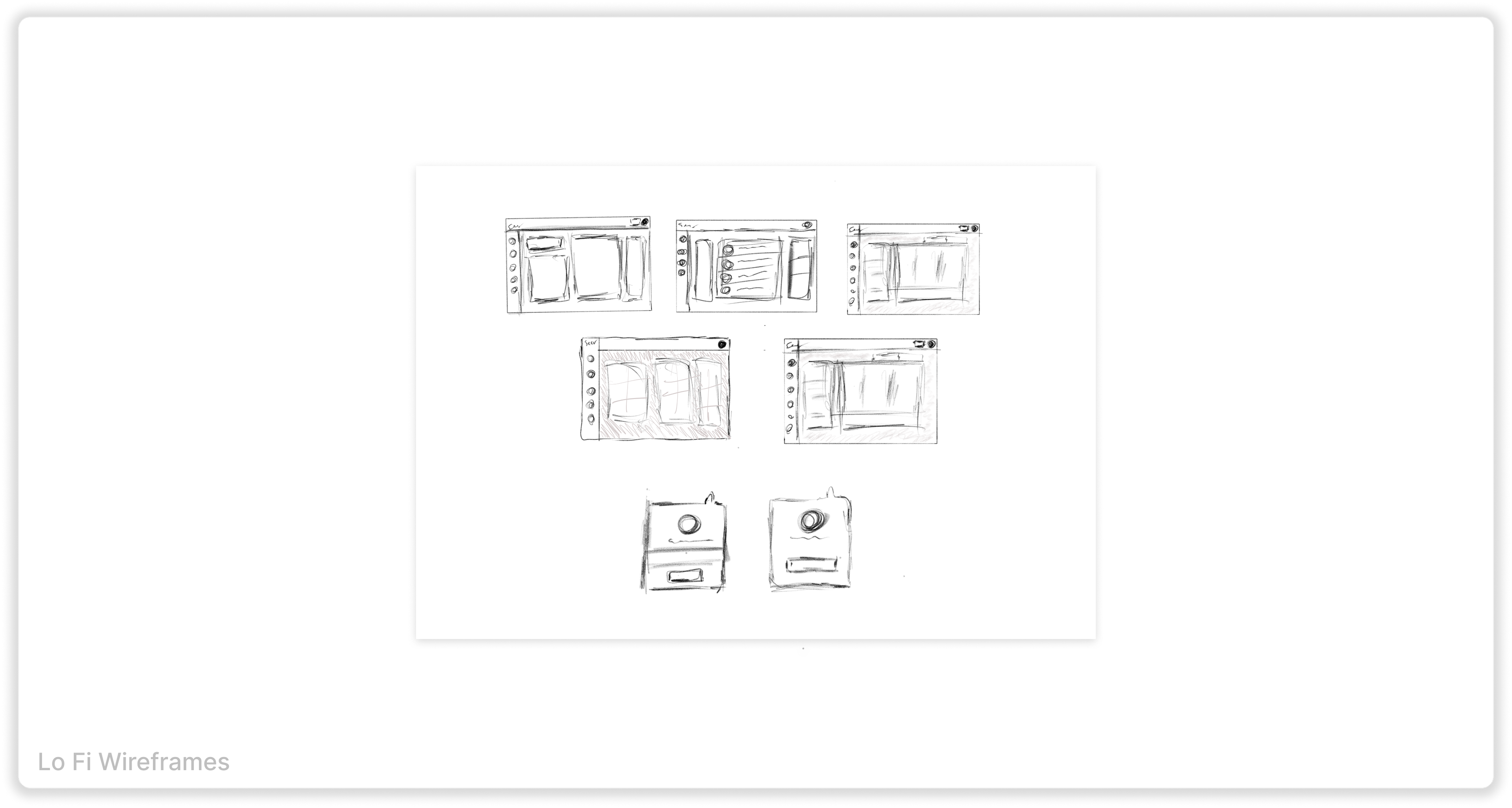
We had to create different screens with slight variations, so for our lo fi drawings, I sketched drawings with slight variations, that could give us the feel we were looking for. My designs are usually centered on warmth and minimalism, so I wanted to keep that in mind, while still providing all the data our users wanted.
Visualizing a User-Centric Experience
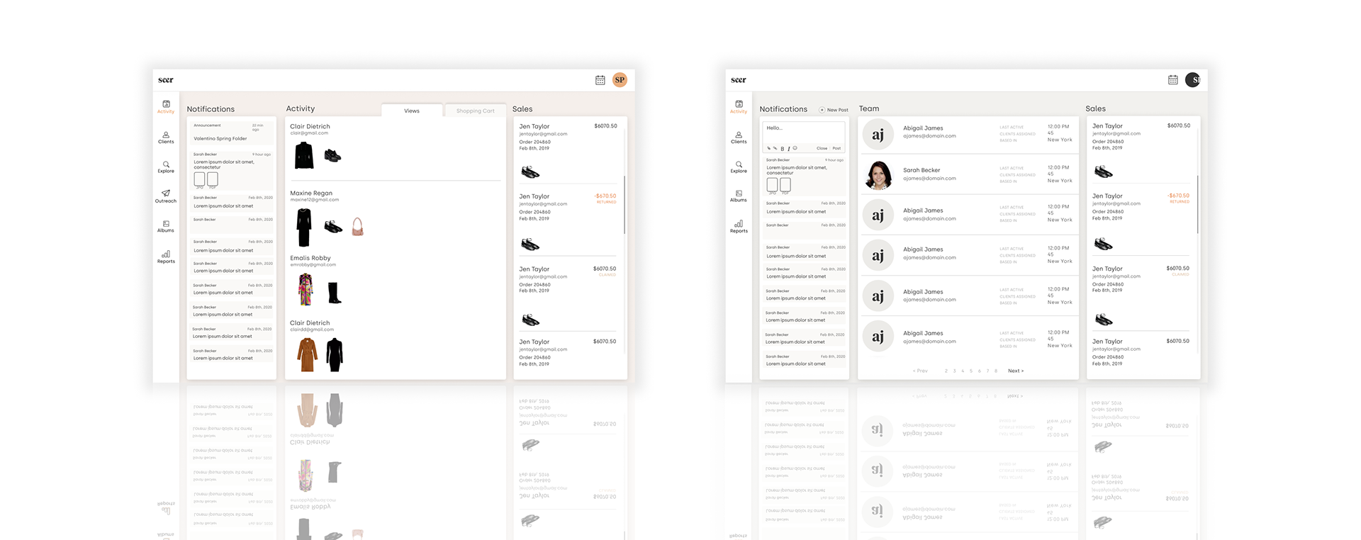
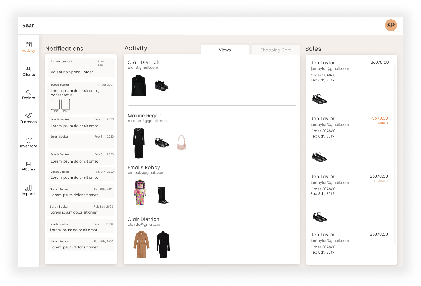
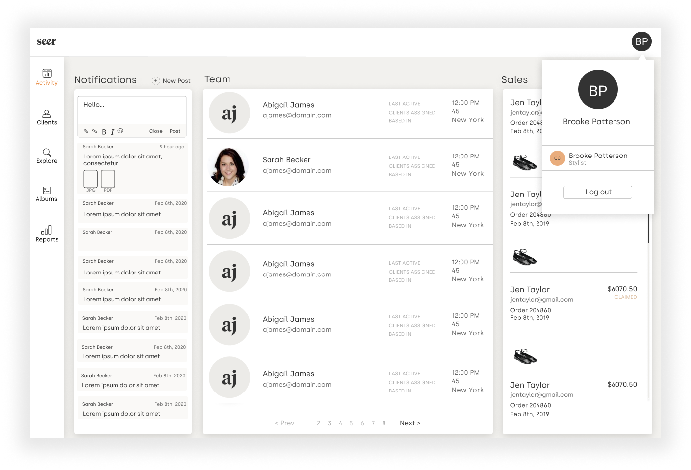
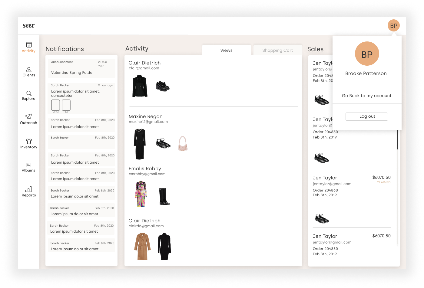
Designing the high fidelity wireframes we again focused on the difference variations that users would see. These two screens show the navigation interface for a a stylist. One with an appointment icon and inventory, and one without. Each company has different needs and requires slight variable changes.
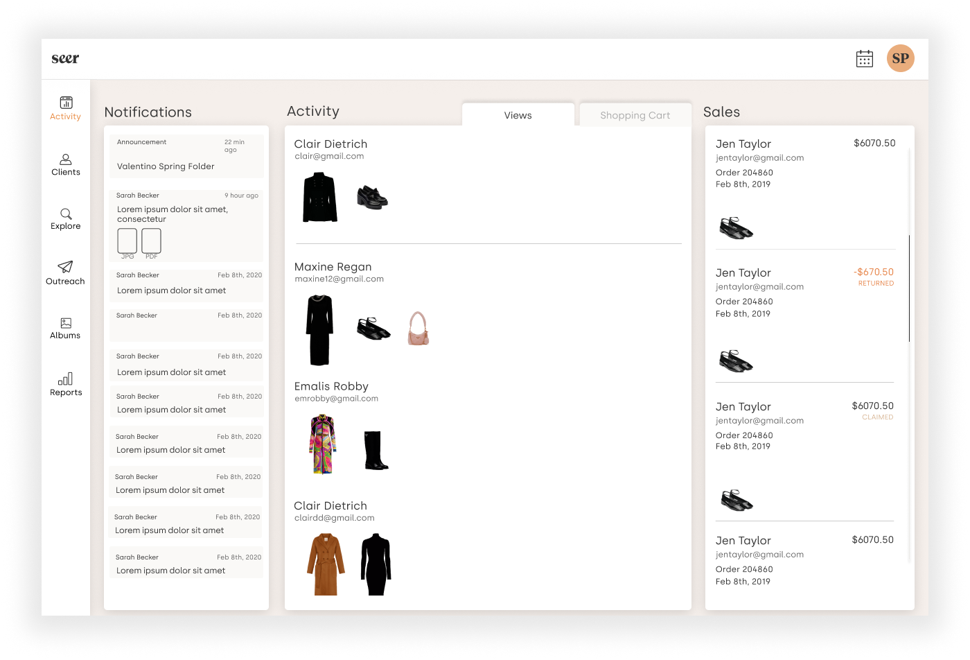
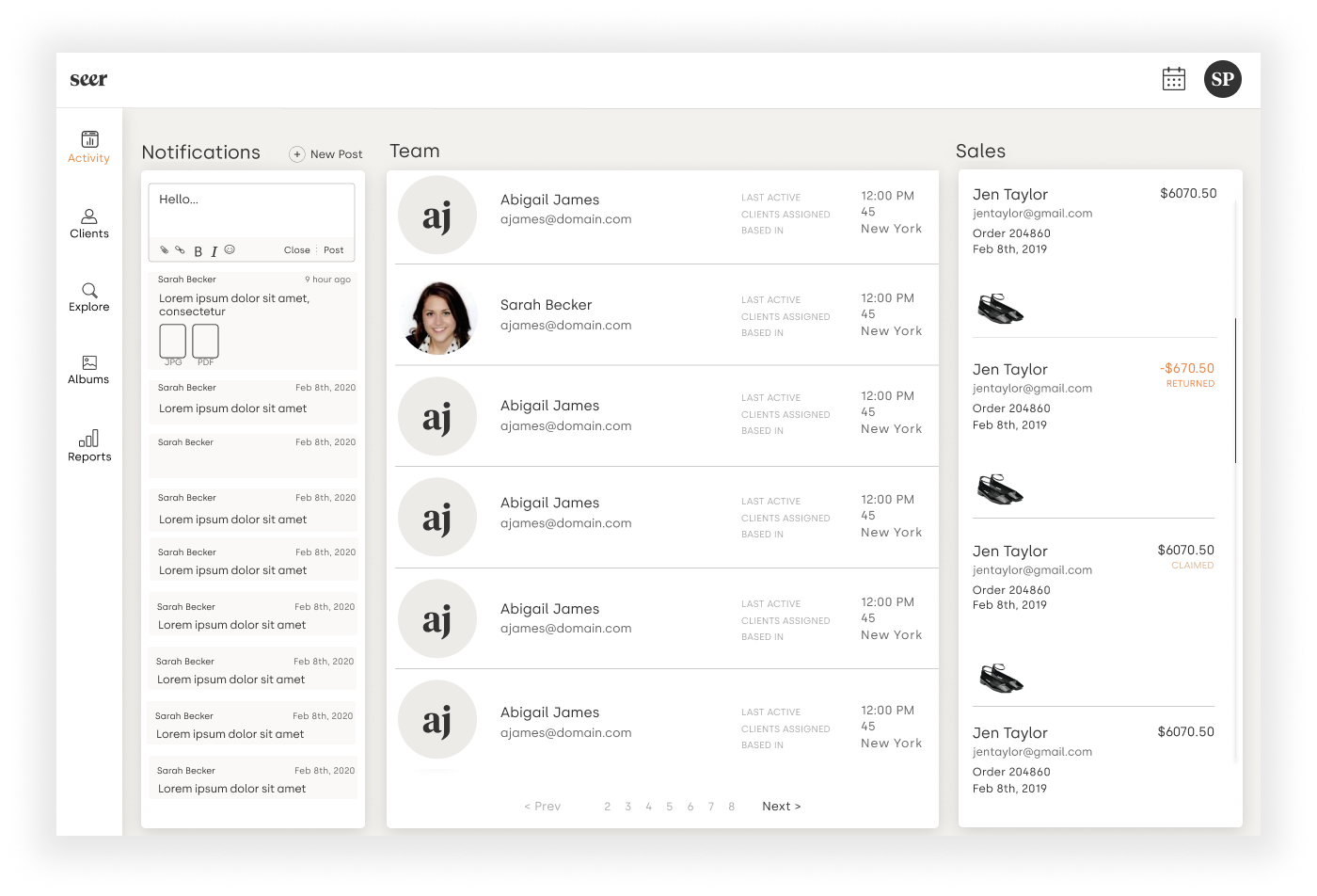
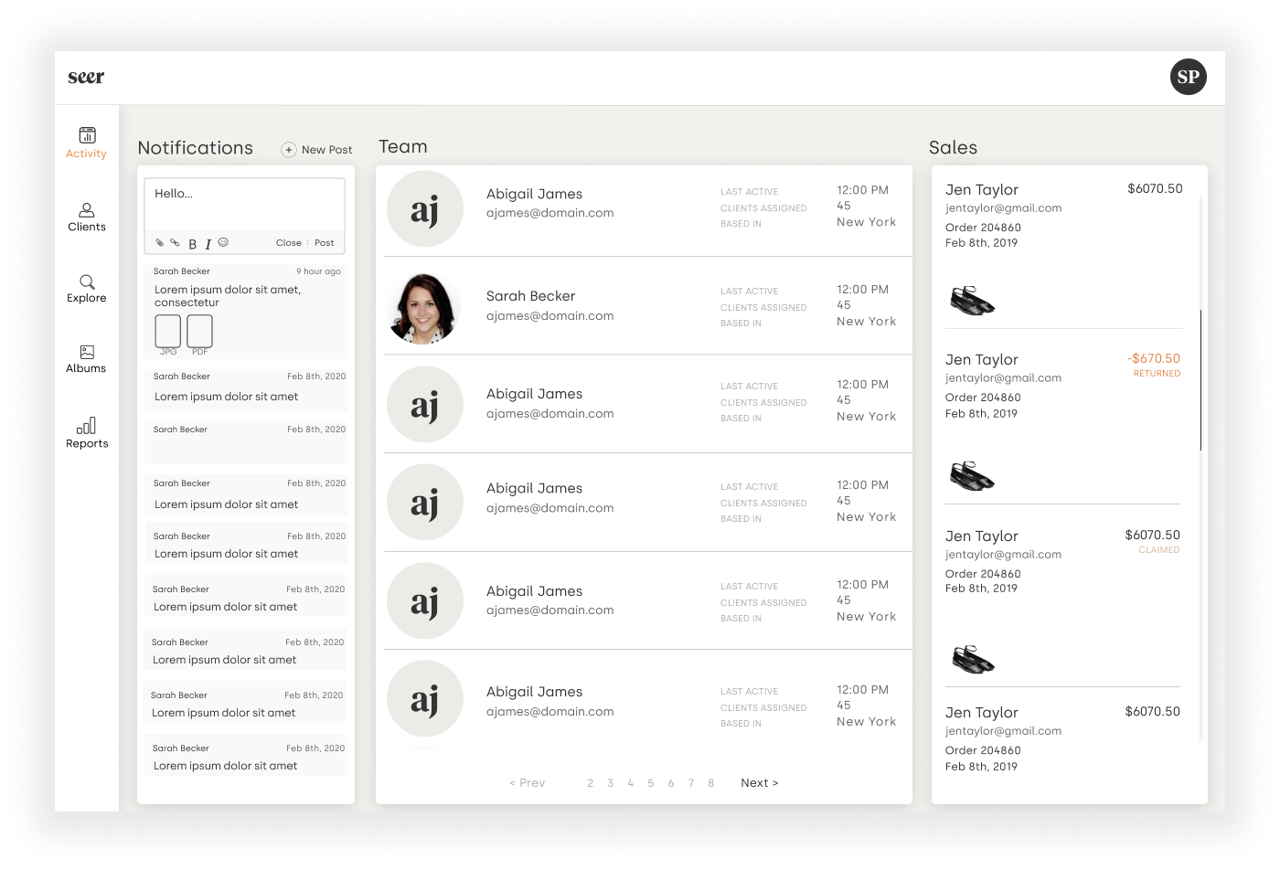
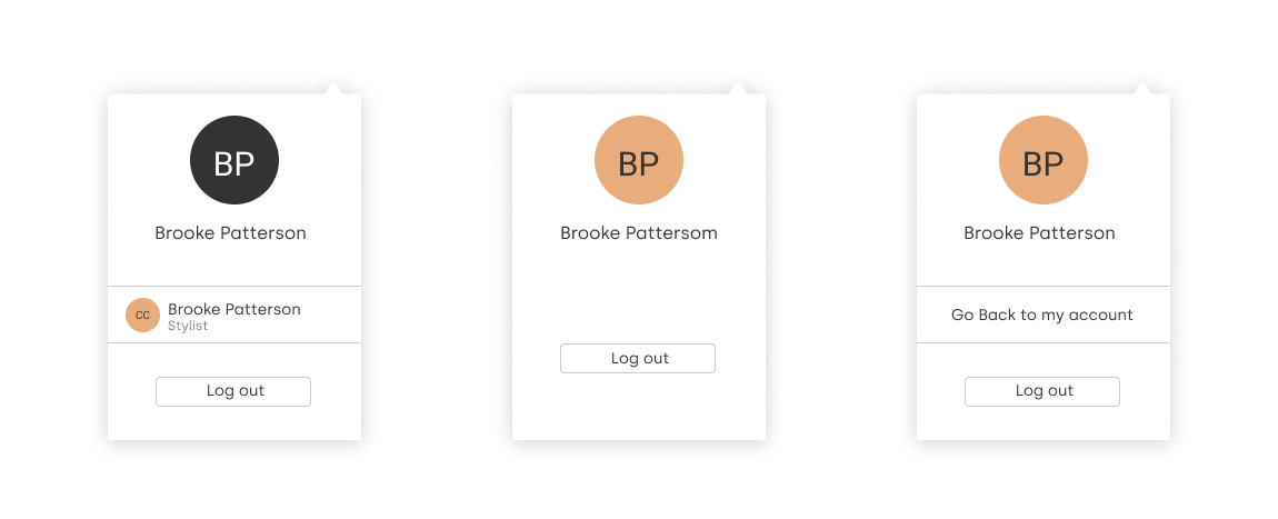
I created drop down tabs for the different kinds of users, and provided a path for users who had access to multiple user profiles.
Reflections and Takeaways
Working on a hard deadline to get the platform ready for Burberry was an interesting experience. Thankfully we were able to get their feedback on drafts, and ideas, before the final prototype was shipped. Overall it was a wonderful and rewarding experience.