Role Team Tools
Research Justin Stein Figma
Ideation Olivia Renaud Adobe illustration
UI/UX Paul Draper Adobe Fresco
Illustration
Prototyping
Overview
Problem
Stylists need to be able to send multiple looks to their clients, quickly and efficiently, while pulling clothing from library sources. The looks need to be able to be easily viewed by clients, which is the opposite of what they get when being sent a standard photo album.
Solution
I designed the Seer Look Book , a new feature in Seers album editing tool that allows users to create a look book using existing content and easily share it with clients.

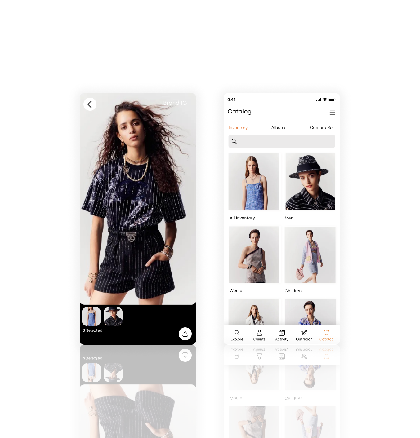
Adding multiple looks
With Seer, find your looks and memories more quickly.
Easily find looks and content from your inventory. Tap multiple looks to include them in your look book.
Creating your look book
Navigate through photos in your look book with the ease of a click.
Review your looks and see them the same way your client will.
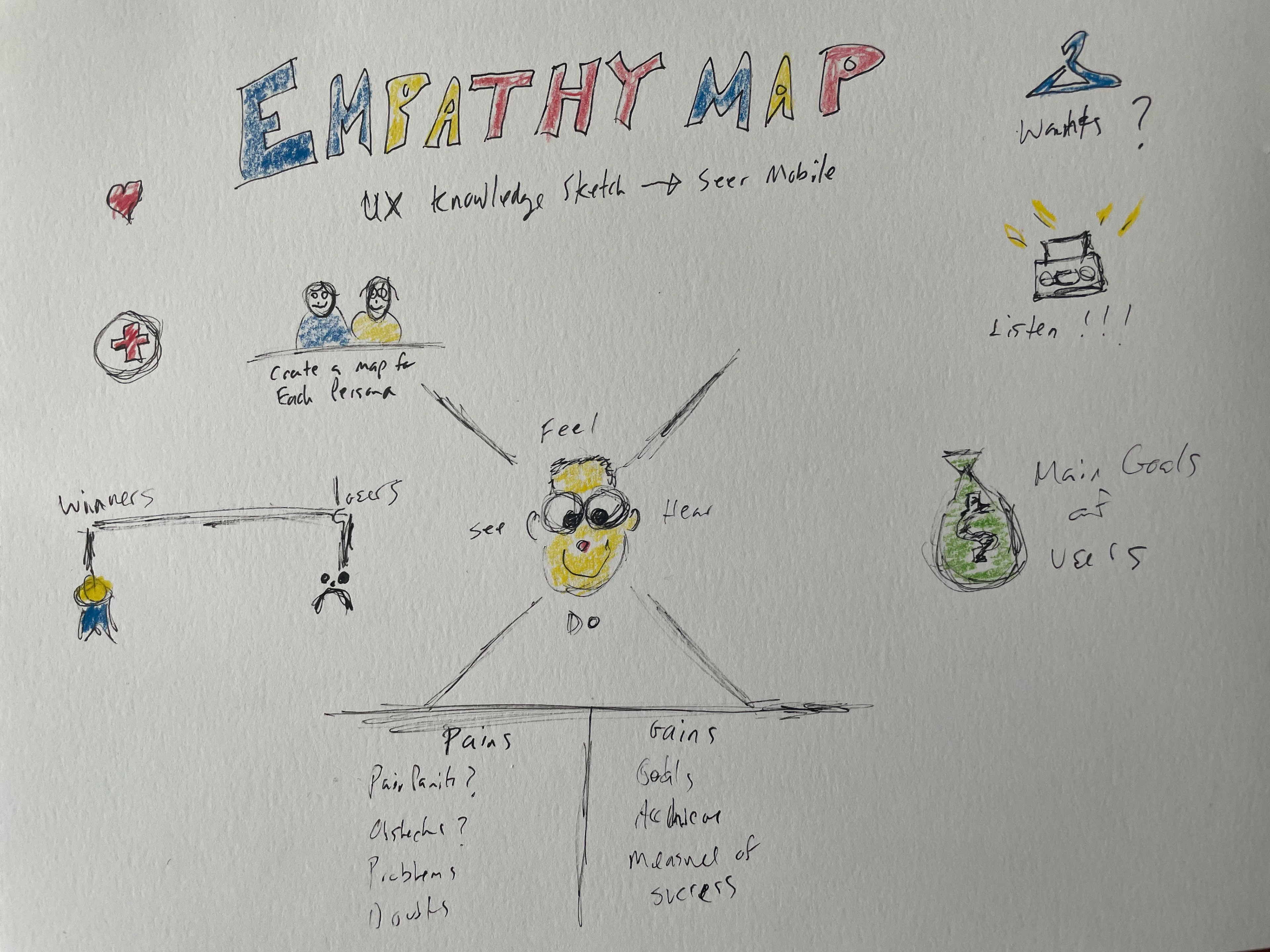
Research
Why does Seer need this feature?
The stylist loved the idea of Seer. Users loved the idea of organizing photos, looking them up, and quickly sharing them with clients. As a designer, I was searching for a way to make the process more seamless. Users had to be able to add multiple items to be sent to their clients, and because this is fashion, it had to look pretty. The # 1 piece of feedback from every user was that the lookbook needs to be pleasing to the eye. It had to look good. It also had to be easy to use, as our users were not technologically savvy. So using natural language to search for photos instead of looking through a lengthy, messy timeline was key.
I believe that Seers technologies can be further pushed to make the photo management experience easier. A problem that my friends and I usually encounter is that when taking photos, we'd like to take a lot of them, and then select the best ones afterward. The selection process can be time-consuming and frustrating, and if we leave all those photos there, they'll soon clutter the photo library, making it hard for us to find what we want. This gave me the initial idea: what if we can rethink the way photos are presented in Seer, and make the selection process and sharing easier?
Domain Research
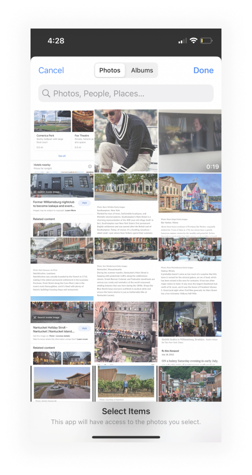
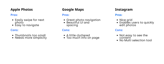
I first looked into the market, trying to find inspirations and gaps among existing products. Our founder and our users made it very clear that they were not tech-savvy, and only really used three applications. So I used those three for research, to maintain familiarity :
Defining User Needs:
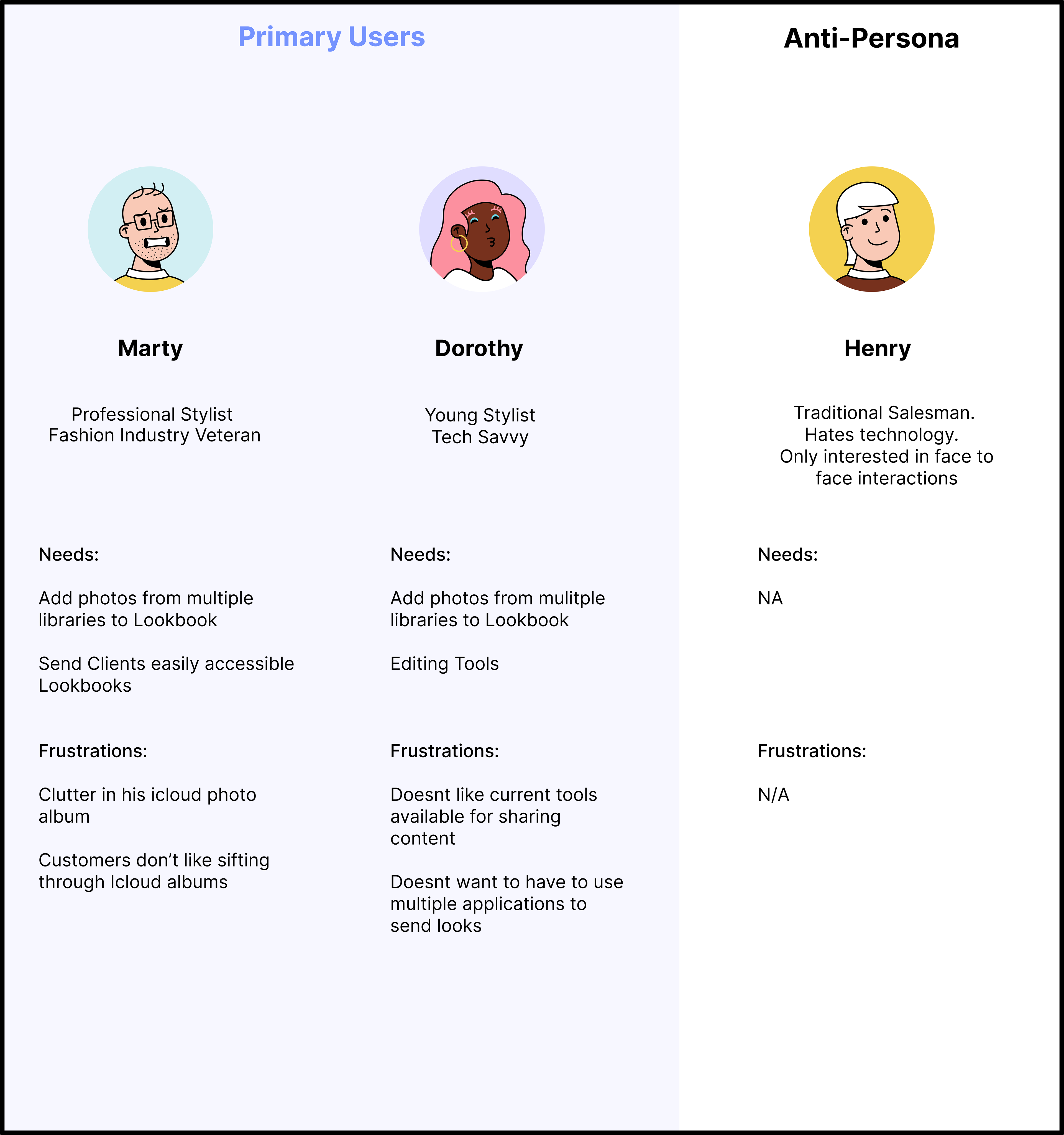
As a designer, I know that I shouldn't design for myself. I cannot assume that the problem is widespread enough that it's worth the effort to design something to solve it. To quickly understand whether this is a problem worth solving, I decided to
1) Speak to our founder and CEO who was a superuser herself and
2) conduct quick, semi-structured interviews with current users.
Super User:
Our super users were users who used multiple tools from other platforms to get the results they were looking for. These users were very tech-savvy and driven. They also represented less than 1 % of our users. So while their feedback was wonderful, we had to take into account that they were not representative of our core user base at all.
Interviews and Personas:
I drafted several questions to help me better understand the problems that the stylists were dealing with. I had the hypothesis that the stylist were probably dissatisfied with using Apple Photos, and Instagram and that their reluctance to use a new application, was more about their experience with new technology.
My hypothesis was right. Our users hated using Apple Photos and Instagram but were very reluctant to try something new, that they didn't fully understand, and could waste more of their time. Our users were very concerned about time.
Having understood the design goals, I started brainstorming and developing ideas that can help me achieve our goals.
Facilitating the Browsing of Past Photos
Right now, users see all of their photos laid out in the "Photos" tab, where similar photos take up a lot of space and prevent them from finding the ones they need. From my user research, I learned that users don't necessarily need all those photos there, especially similar ones. They just want to see the key photos that remind them of what they've done and where they've been. Only if they are interested do they want to see all the different photos related to that particular moment.
Where Should the design happen?
My first instinct was to design another album, but I realized that users didn't want an album, they wanted something sleeker and fiercer, and much easier to use. I also found out that clients disliked photo albums.
Seer enables users to search for particular content using natural language (e.g. Prada, Gucci, Off-White, etc.). I wanted to automatically create cookbooks for photos taken in certain places. Should I focus on these functions instead to better help users browse through their memories?
I debated trying to create some sort of function where users could see all their content in one place, but through research I found that users sent content to certain clients from different libraries, so it was important to keep libraries separate and focus on getting users through their journey easily and directly to the look book.

User Feedback: How to Identify the Most Important Moments?
Feedback I received was surprising: some users said that sometimes having all the similar photos displayed in the camera roll actually helped them identify which moments were the most important. When they are quickly scrolling through the timeline, they'll stop when they see, for example, that they've taken 15 similar photos for one place they visited. That probably means that they spent a lot of time there, or that the place was special. Grouping all 15 photos into one single thumbnail loses that aspect, though it helps them clean up their photo library.
That was something I was not aware of before. Solving one problem might lead to the creation of another. Is there a better way to solve the clutter problem while still having something to indicate the importance of a group of similar photos?
That was something I was not aware of before. Solving one problem might lead to the creation of another. Is there a better way to solve the clutter problem while still having something to indicate the importance of a group of similar photos?
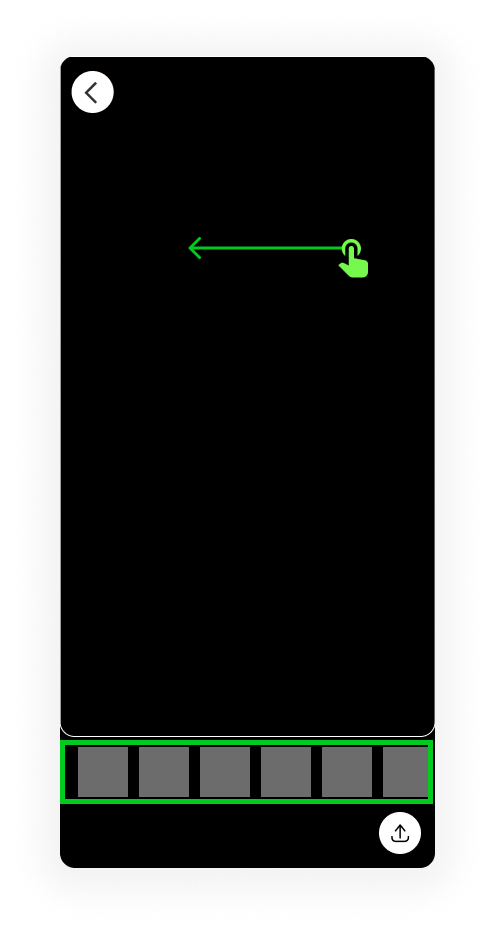
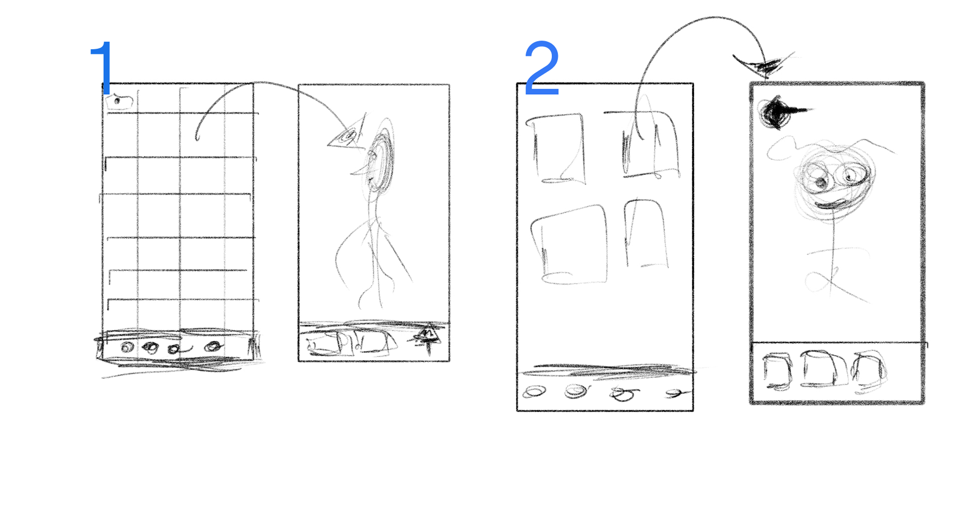
Navigating Between Photo Groups/Photos
Swiping is the default way of navigating between photos; it
should be mapped to the default task, which is to
navigate to the next group of photos/photo, since most times
users just want to see one best photo.
should be mapped to the default task, which is to
navigate to the next group of photos/photo, since most times
users just want to see one best photo.
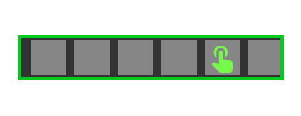
Push button for selection
Navigating between photos with a touch was important to users, so we made the thumbnails double the size of Apples.
Final Designs
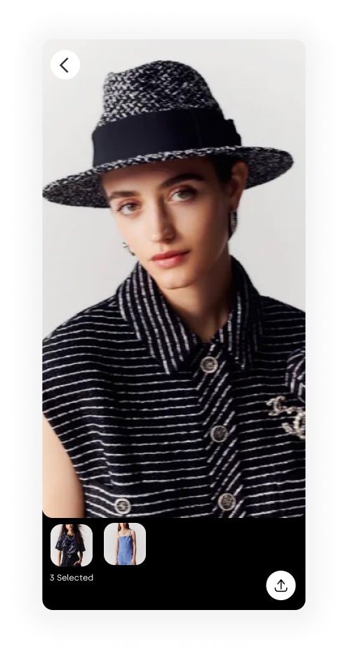
Inventory
Adding photos from inventory


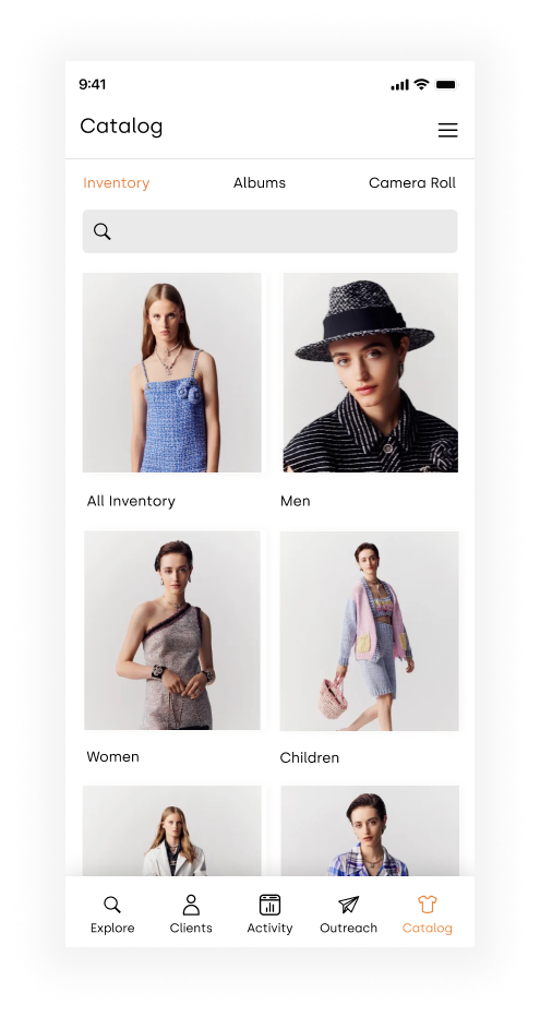
Inventory
Inventory is where users get the majority of their looks, so we made it the first choice available, and focused heavily on making the navigation seamless
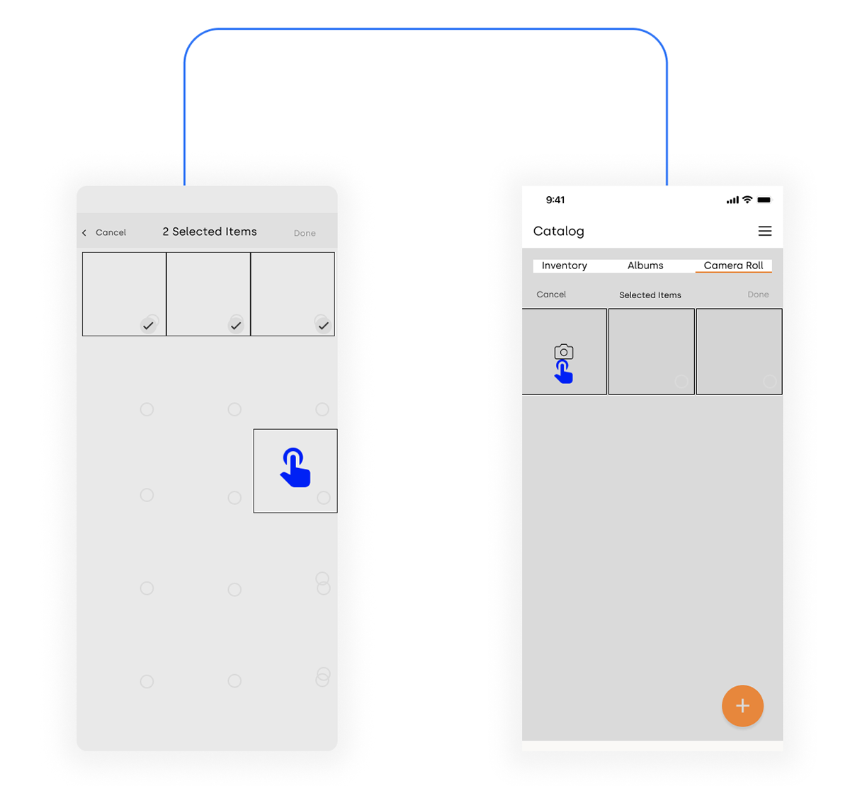
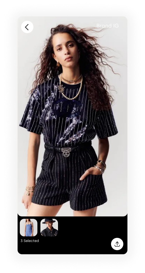
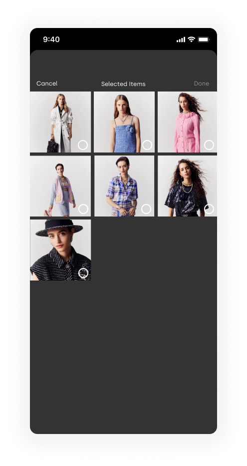
Camera Roll
Adding photos from camera roll


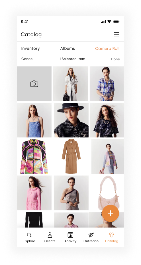
Camera Roll
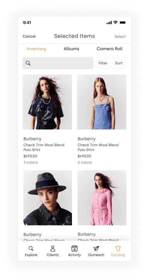
Adding photos from camera roll to the look book. After the user punches the select button, "selected items" displays in the sub header, and indicates how many items have been selected
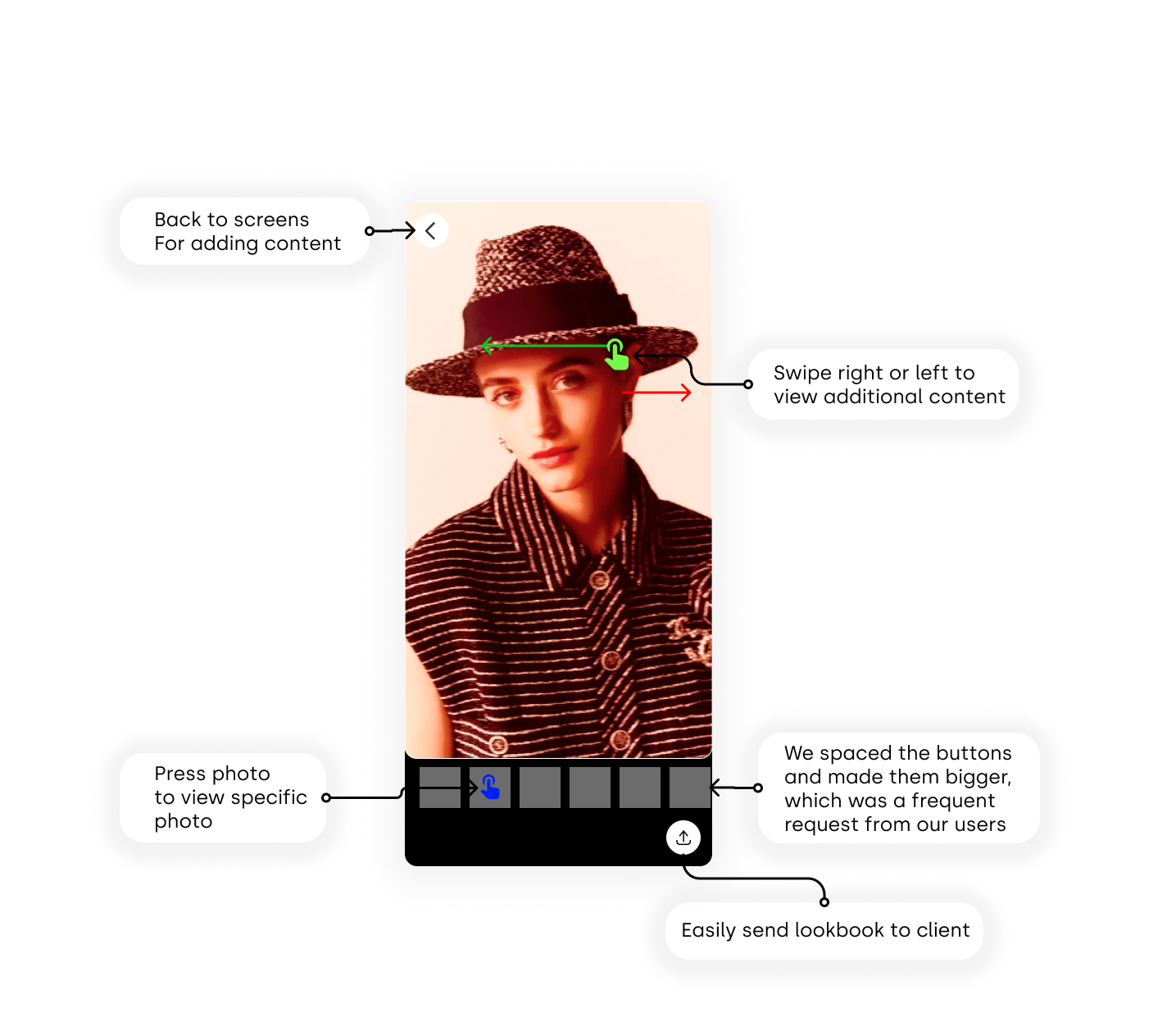
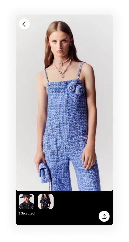
Look book
Look book review and navigation
Look Book
Once the user has selected the content they want to include in their look book, they can navigate and review the content by swiping or punching the thumbnail.
Recent History
Adding photos from recent history album
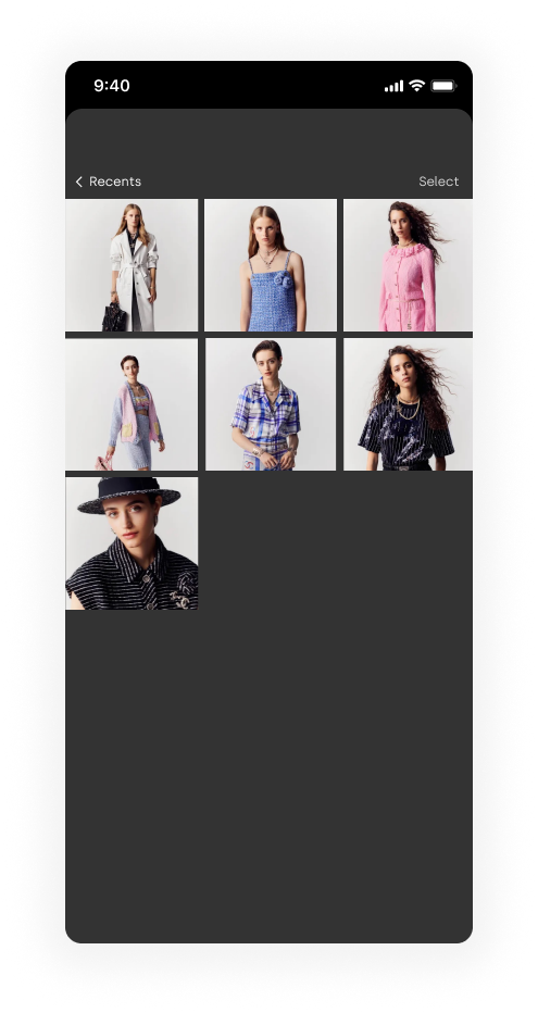

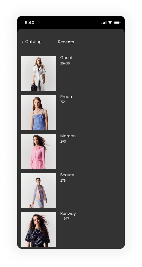
Recent History
When selecting from recents, after you select your album, you'll be able to add multiple items from the album, that will appear in your personalized look book.
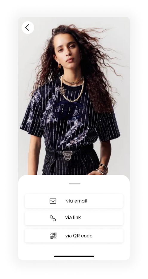
Reach
After you've selected all the content for your look book, you are now ready for outreach! You can send the look book three different ways. Via email, link, or QR code. The flow below shows the journey for all three.

FUTURE STEPS
Editing
Users asked about editing quite a bit in our user interviews. The next step will be adding design features to give customers more freedom in customization and allowing the users to be more creative as they get more familiar with our tool.
Evaluating the Design with Users
Evaluating the Design with Users
Do the different ways of navigating between photo groups and users within a photo group make sense?
Is the look book all they imagined? Do they need more options? Does it look good enough? Is it beautiful? As users continue to use the finished product, those questions will start to be answered.
Integrating with Existing Features
Adding a new feature to an existing product means that the feature doesn't stand on its own and must fit with the product as a whole. Making sure the look book exist well with Seer will be ongoing.
WHAT I LEARNED
Considerations for design
Focusing on a new feature within an existing product is challenging and exciting. I've been down this road many times, and it never stops being surprising and life-affirming. I love creating products, there is nothing I enjoy more, and this project was no different.
I tried my best to not disrupt the existing functionalities that make sense for the users so that while they are using the app for other purposes, they won't notice the functionality change.
Because of the large user group, for the interactions inside the new functionality, I still made more conservative choices to choose those that fit better with users' existing mental models.
Capturing Creative Ideas
I learned about the importance of capturing creative thoughts in an interview I watched with Ideo's Tom Kelley. I also learned before that sometimes creative ideas just come to mind at unexpected times as long as you've thought about the topic enough.
While I was doing this project, I made sure to always capture any idea that came to my mind, regardless of its quality, on my Notes app. Hiking and walking gave me time to let my mind wander and generate new ideas. I'd then find time to sit down, look through them, and build on them. Several of them ended up in the final design of the feature. I'll keep on doing this for my design in the future.
Alright, alright, alright! You made it! Thank you all for reading through this case study! Hope you enjoyed learning about my design and thought process.
Alright, alright, alright! You made it! Thank you all for reading through this case study! Hope you enjoyed learning about my design and thought process.